Introduction
When you need a car for a few hours or a few days, you shouldn't have to open three different apps.
But that's exactly what most people do: Uber for rides, Turo or Zipcar for rentals, a separate app for peer-to-peer sharing.
Uber Rent lets you self drive a car, pick it up yourself (or have it delivered to you), and drive it for as long as you need.
Uber Carshare does the same for shorter, peer-to-peer rentals — cars owned by people nearby,
available by the hour.
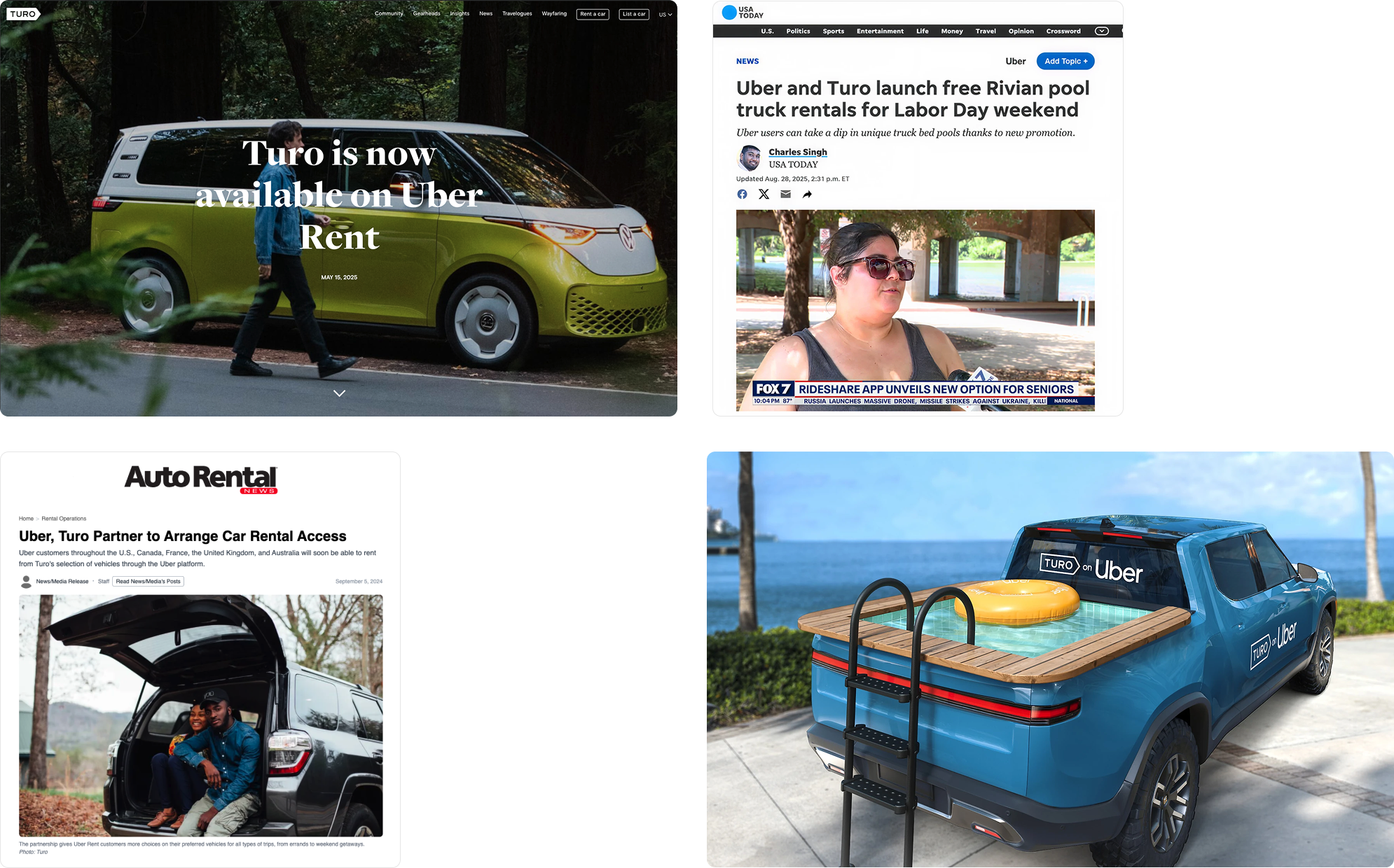
Both products work, making +50M ARR each. But users kept asking the same question: why can't I see everything in one place?
Operational in : 🇺🇸 United States · 🇨🇦 Canada · 🇬🇧 United Kingdom · 🇪🇺 European Union
Role and Impact
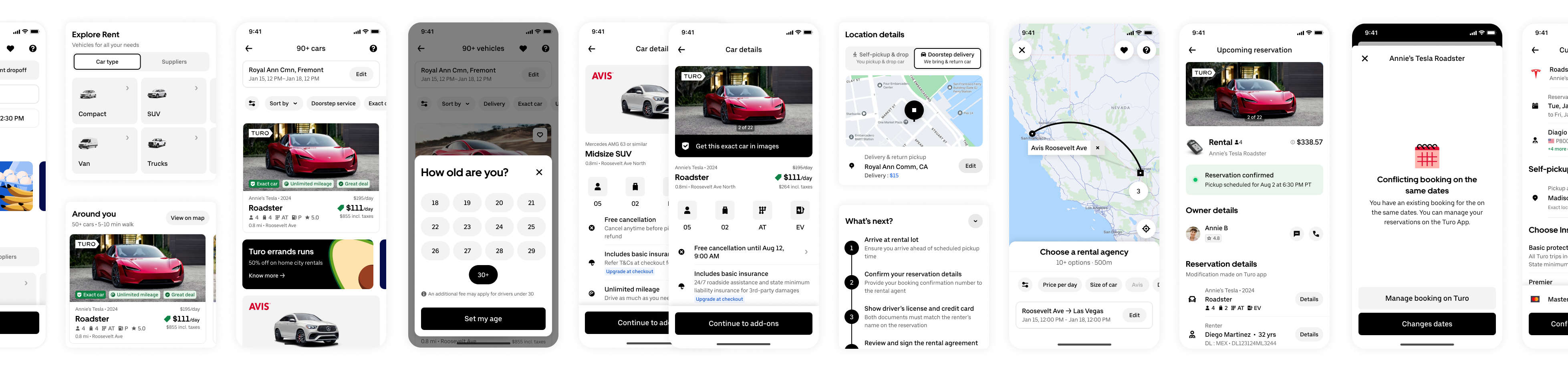
I led design on the unified rentals experience across mobile and web for renters and valets, making Uber Rent not only a rental agency
aggregator but to also include P2P players such as Turo, Getaround and Zipcar's inventory as a first-class option within the same surface.
That meant resolving some genuinely hard design problems: how do you present cars from different providers, with different pricing models, different pickup logistics, and trust signals,
in a way that feels coherent and comparable? How do you help someone choose between a peer-to-peer and a traditional rental without overwhelming them with complexity?